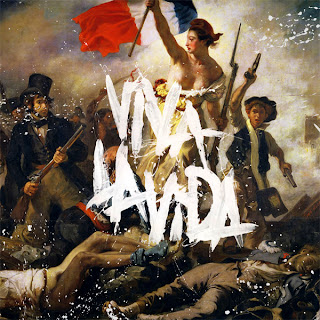
The image
on the front of the album is a painting by Eugene Deloeroix and named 'Liberty
Leading the People', and is a painting of the revolution of France in 1830.
This gives the impression that the album could have a political theme with
strong messages coming through in their songs. It also shows the desire for
freedom.
A
convention the album cover does however break is that the name of the band does
not appear anywhere. This indicates that the band doesn't need to state their
name in order for the album to sell and for people to know who it is by.
The title
of the album is ‘Viva La Vida’ which means ‘Live the Life’.
This unique front cover reflects on the band's unique sound and the genre of music they fit into - alternative rock.
The back
cover of the digipak is in a classic and formal style with the track listing
central. It is quite a contrast to the front cover which is more hectic. The
background is plain black and with the writing being in gold it suggests high
quality music. Also the colour gold suggests wealth and that people who aren’t
rich can enjoy.


No comments:
Post a Comment